Form Best Practices
A form is one of the most important interactive elements on a site. Whether it allows users to purchase, sign up, or inquire, a difficult-to-use form can counteract all effort spent to advertise, solicit site visits, and sell the visitor on the value of completing the form. Below are a list of best practices you should consider when building or updating your form.
Last updated 1/10/20
Jump links
Mobile & Desktop
Reinforcing Value
Form Structure
- Make the Form Immediately Accessible
- Limit Distractions
- Ask Only What Is Required
- Order the Form Logically
- Group Related Information
Navigation
- Autofocus
- Automatically advance to the next field
- Desktop-Only: Make the Form Keyboard Friendly
- Progress Bars
Information Entry
- Labels
- Placeholders
- Input Masks
- Don’t Slice Fields
- Allow for Browser Autocomplete
- Allow for Google Maps Autocomplete
- Help Users Checkout Faster with Autofill
- Mobile-Only: Match Keyboard to Input
- Ditch the “old” Captcha
- Defer to a List of Selections Over a Blank Field
Error Handling
Mobile and Desktop
A user’s form interaction varies greatly between devices. Ensure you are building the best experience for each device used to complete your form.
Reinforcing Value
Reinforce value before, during, and after information entry. Are you getting the visitor excited about what they’ll receive when they fill out your form?
Submit Button
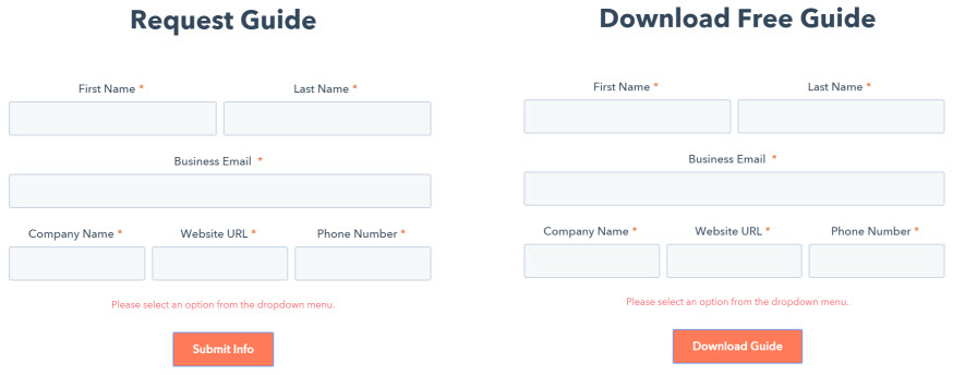
Does the submit button say “submit?” Can you change this to shift focus from the visitor giving information to the visitor receiving something of value? Which of the options below seems more appealing?
Thank You Page
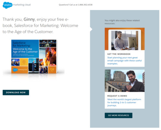
After the user completes their entry, you can reinforce they made the right decision. This screenshot shows the “thank you” page a user is shown after completing a form on Salesforce.com. Some best practices on the “thank you” page include:
- Personalizing the thank you copy
- Using images to show the value of what the user is receiving
- Dynamically populating other resources the user may find valuable
Form Structure
Make the Form Immediately Accessible
Users land on your sign-up page for a reason. They want to sign up. Your job is to make this process as easy as possible. This requires removing all unnecessary effort.
If a user must scroll down the page to access a form not immediately visible, you are adding effort. While this is a small amount of effort, it all adds up. You are also adding to the chances they’ll get distracted by the content that is immediately available and move onto something else.
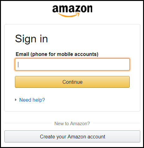
If you look at the sign-up page of Facebook, Amazon.com, and Google, you’ll notice the simplicity of the form and the fact it is immediately available. In a 2008 study of one hundred of the most visited sign-up pages on the web (think Yahoo, LinkedIn, Myspace), sixty one percent of forms had removed all distractions so that the form was the only thing on the page.
Limit Distractions
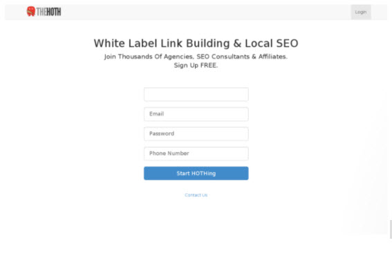
Remove distractions such as large banners, unneeded information, or CTAs that distract the user from completing the form.
Form with distractions:

Form without distractions:
Ask Only What Is Required
Make sure to ask only what you need. Every extra field you add to a form will affect its conversion rate. Always consider why you are requesting certain information from the user and how you will use it.
- Do you have a field for the landline and mobile phone number? Given most online users only have a cell phone, can you just request a phone number?
- Ensure you’re not requesting information that can be derived from other inputs. For example, there is no need to request city and state if you’re already asking for the zip code.
Order the Form Logically
- Start with the easiest information first. If you have a question that may be more difficult than others, place it at the end. The idea is that someone will be more invested in form completion by the time they get to the difficult question.
- Ask details logically from the user’s perspective, not from the application or database’s perspective. Typically, asking for someone’s address before their name would be unusual.
Group Related Information
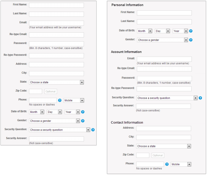
Group related information into logical blocks or sets. The flow from one set of questions to the next will better resemble a conversation. Grouping together related fields will also help users make sense of the information they must complete. Compare how it works in the contact information forms below.
Navigation
Information Entry
Labels
The label provides direction to the user, telling them what information is needed in a form element. Here are some considerations when auditing the labels on your form:
- Do labels exist for every form field? If not, is there a good reason why?
- Does the label still exist when the user is providing information or does it go away? If the label disappears once a user clicks on the input field, the user cannot double-check they wrote what was required.
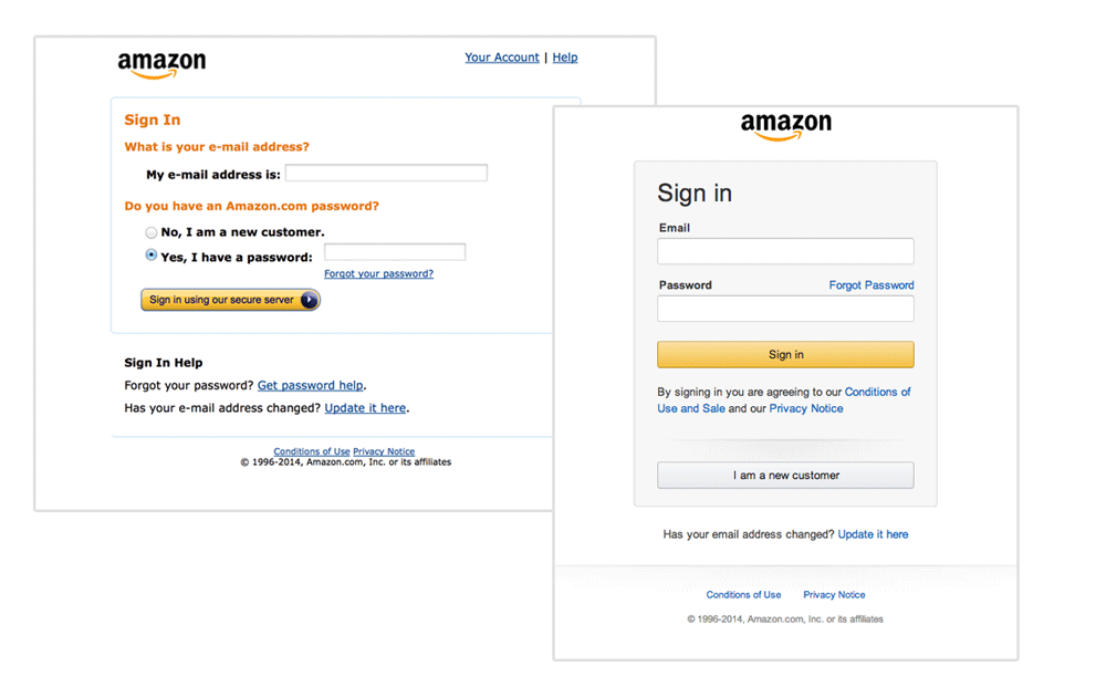
- Are your labels short and descriptive so that users can quickly scan your form? Previous versions of Amazon’s registration form contained a lot of words, which resulted in slow completion rates. The current version is much better and has short labels.
Placeholders
Placeholders provide a hint to the user about what’s expected in the field, typically by displaying the value as light text until the user starts typing.

Caution: Placeholders disappear as soon as the user starts typing, thus they are not a replacement for labels. They should be used as an aid to help guide users on the required format and content.
Input Masks
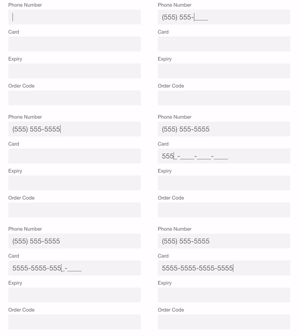
An input mask helps the user format text automatically. As the field is filled out, users can focus on the required data and more easily notice errors. In the example below, the parentheses, spaces, and dashes are applied automatically as the phone and credit-card numbers are entered. This simple technique saves time and effort with phone numbers, credit cards, currencies and more.
Don’t Slice Fields
It’s happened to all of us. You’re asked for your birth date, phone number, social security number, address, or some other information with multiple elements. You have to put each element into its own box.

The user has to click, tap, or tab to get to the next field. It wastes precious time and energy — and it can irritate your prospects.
Allow for Browser Autocomplete
Users appreciate when websites save them time by automatically filling common fields like their name, phone number, and email address. It also helps reduce input errors — especially on phones. Below is an example of Chrome’s autocomplete feature.

Allow for Google Maps Autocomplete
Filling out an address field is often the most time intensive part of any registration form. A tool such as Place Autocomplete Address Form enables users to enter their address with fewer keystrokes than regular input fields.

Help Users Checkout Faster with Autofill
In addition to autocompleting fields like your name and address, many browsers support auto filling credit card information.

Mobile-Only: Match Keyboard to Input
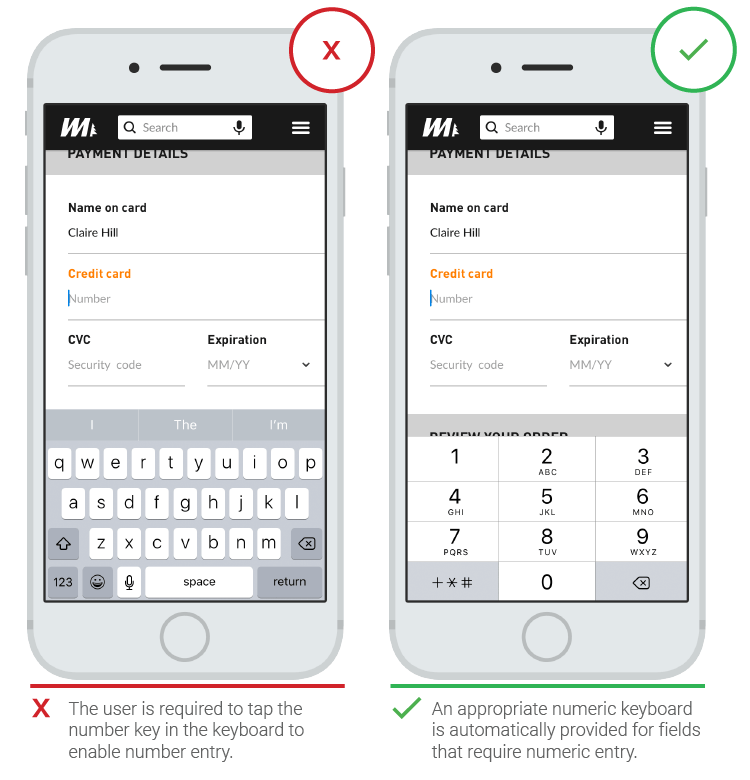
Phone users appreciate forms that provide the appropriate keyboard for the requested information. For example, presenting number pads for entering credit card information or a visual calendar when requesting a date.
Ditch the “old” Captcha
Chances are, you’ve been annoyed by one of these before:
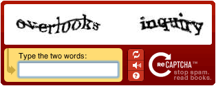
While these help website owners reduce spam, they irritate users. Try replacing the old captcha with the new version here or ditch the captcha all together.
Defer to a List of Selections Over a Blank Field
Selecting items from a list is naturally easier than filling in a blank text box. A list input option also helps ensure a site receives the information it needs.
Error Handling
While errors should be prevented as much as possible, they are inevitable. Below are some best practices that make it easier for users to recover from errors.
Inline Validation
Inline validation involves checking the user’s input and notifying them of any errors as soon as they finish entering information into a field, versus after form submission. Fixing errors immediately versus hunting for them after submitting saves the user time and effort.
Show Errors After the User Moves to the Next Field. Not Before or During Entry.
Is your inline validation showing errors before or during input? For example, are you showing an invalid error as someone starts entering their email because they haven’t entered “.com” yet? This can cause frustration so ensure you’re only validating AFTER the input has been made. Studies have shown inline validation displayed after input results in faster completion times and reduced error rates.
Helpful Error Messaging
Are your error messages helpful? Which of the following is more informative?
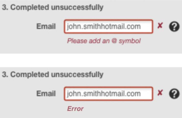
Can you avoid negative words like “error,” “problem,” or “issue,” and instead use positive messaging?
Additional Reading
- Helping users checkout faster with Autofill
- Creating amazing forms – An article with best practices from Google
- Designing efficient web forms – Best practices for efficient form design
