Top 25 CRO Tactics of 2023
These tactics are easy to implement in 2023 for the following reasons:
- Easy to apply: They work across a variety of business types
- Easy to implement: Supported by most content management systems
- Easy to get approved: There are plenty of case studies proving out the success of these tactics

#1 Add Social Proof
Social proof is anything that proves others value your product or service. It is often found in the form of customer testimonials, awards, and well-known businesses you have worked with. These give you instant credibility and make the buyer more comfortable with a purchase decision.
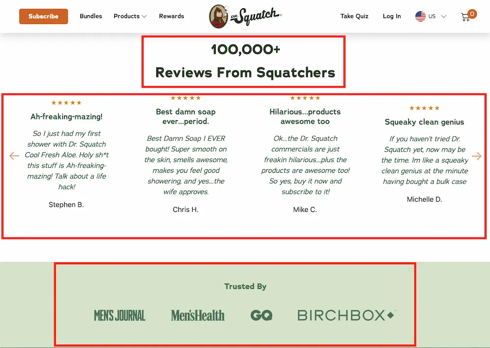
Example – Drsquatch.com provides social proof by showing you the product popularity, customer testimonials, and press from other popular websites.
#2 Include Reassurance Copy
Price match, guarantees, free returns, third party reviews…these are all examples of reassurance copy that remove the micro barriers preventing or delaying a purchase. They ultimately work together to reassure the consumer the right purchase is being made.
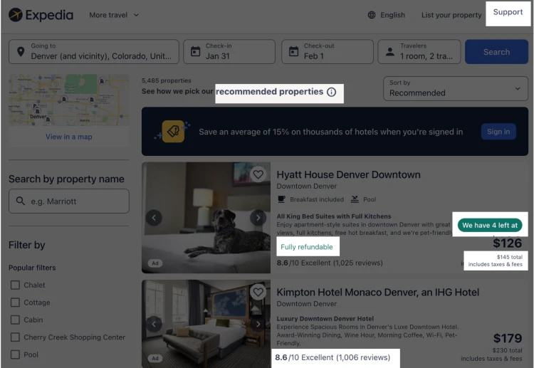
Example – Expedia.com has a lot of reassurance copy including full refunds, social proof (reviews and popularity) and price transparency.
#3 Compare Yourself to Competition
If you don’t do it, consumers will. This works best for products like software where the consumer has a set of needs and is searching a competitive set for which option best satisfies those needs. By preemptively addressing this comparison, you can own this conversation.
Example – Monday.com has fully embrace comparing themselves to the competition. They even have paid search campaigns to get ahead of this traffic:
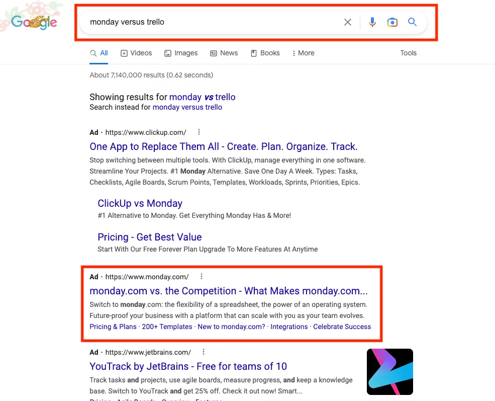
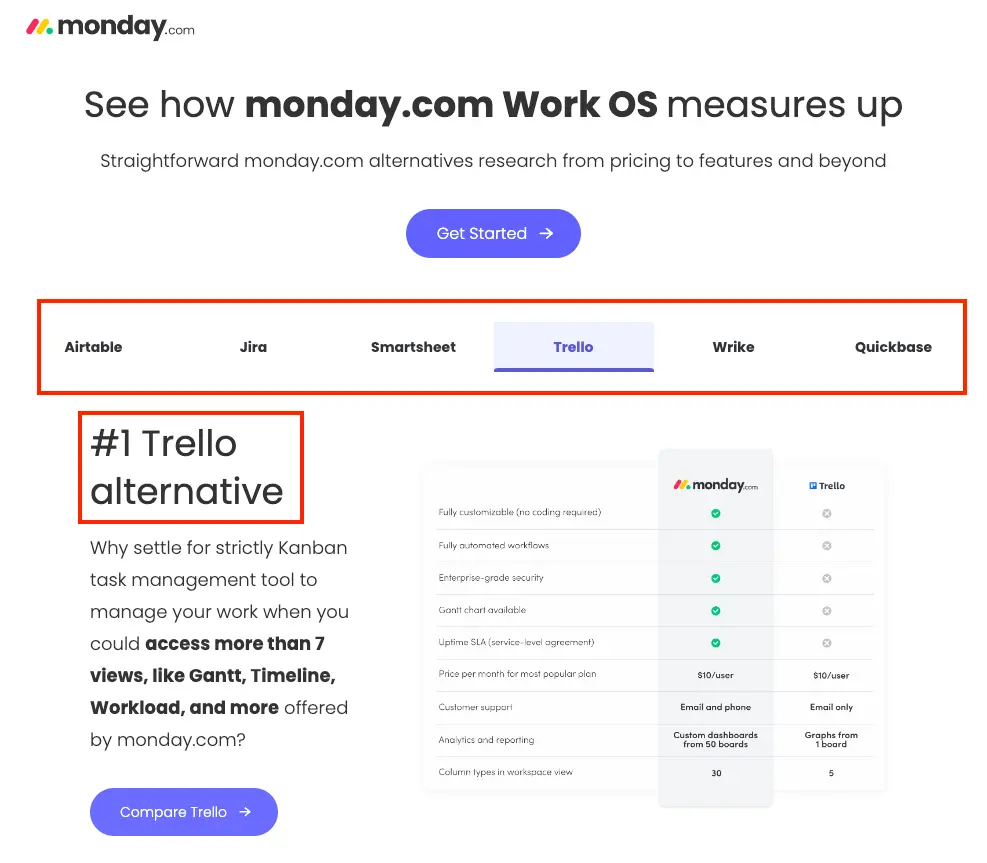
These ads send the user to a page that compares Monday to all other project management software. In this way, Monday owns the comparison conversation.
#4 Speed Up Your Website
A slow site leads to higher bounce rates, shorter sessions, and more abandoned carts.
But don’t take it from me. Amazon estimated one second of site delay could cost them over $1 billion in annual sales.
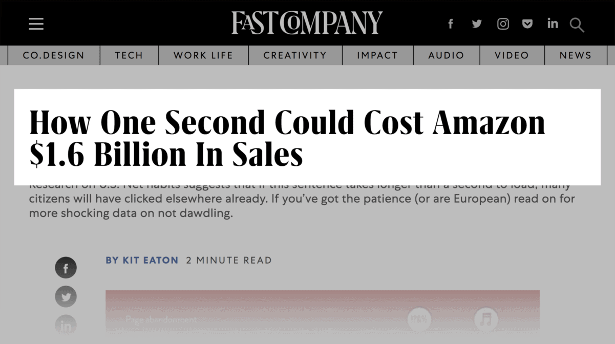
There are a wide range of studies quantifying the impact of speed on different site metrics.
Google found that bounce rates increased 32% as page load times increased from 1 to 3 seconds.
And site speed doesn’t just reduce the number of visitors. This A/B test showed how a 2 second delay during the checkout process increased cart abandonment 30%!
Finally, slow speeds contribute negatively to brand sentiment. If your site is slower than competition, the customer may wonder where else you are falling short.
#5 Offer a Discount to New Customers
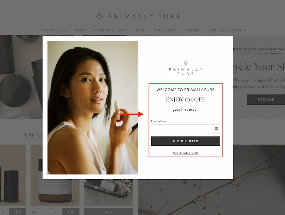
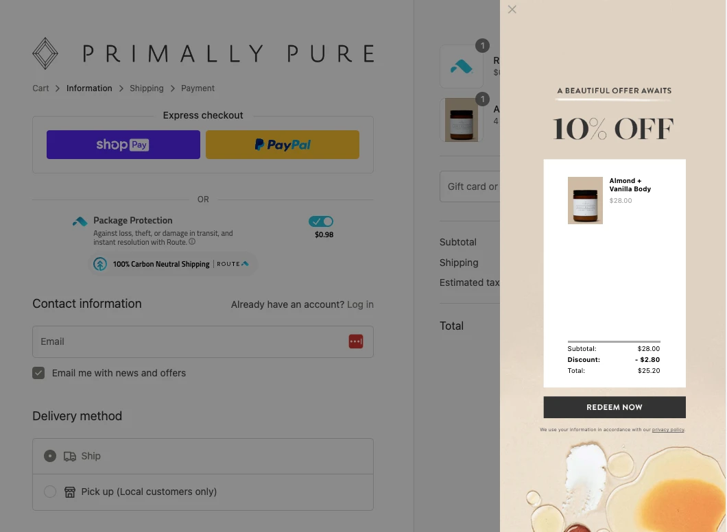
Do you have a good product your customer will buy over and over again? Why not give them 10% off their first order? The lifetime value you’ll receive will more than make up for the initial discount.
Example – Primallypure.com offers new customers 10% off their first order. This site sells items like deodorant customers will order on a recurring basis so it makes sense to capture potential customers before they go somewhere else and give that business owner their money.
#6 Add Multiple High-Quality Images
Lovehair.com provides multiple, high-quality images along with influencer videos to show the quality of their products.
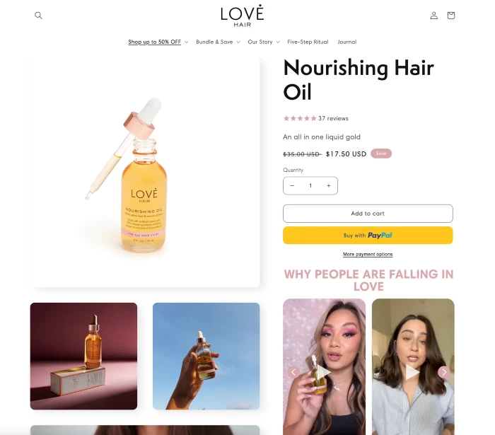
All the CRO tactics in the world won’t help if your product has one, small, fuzzy image you took with your 2017 iPhone. While topic of product imagery runs deep, here are some of the most important best practices:
Best practices:
- Multiple images (three or more)
- High quality images only
- Different angles
- Work well on mobile devices
- Avoid manufacturer images and stock photos
- User submitted photos could be a nice addition if they are high quality
- Videos if possible
Additional reading:
Relevant case studies:
#7 Offer Free Shipping
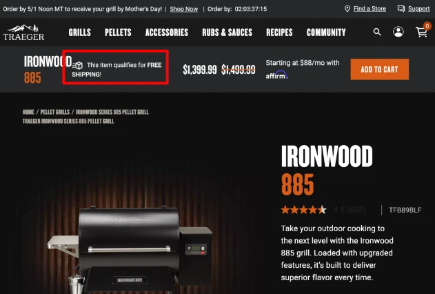
Free shipping works because it is perceived as getting something for nothing. Even though we logically know shipping has been priced in, one all inclusive price seems like a deal.
This plays into the aggregate effect which states that negative experiences, like costs, are less painful when grouped together.
Disclaimers:
- Free shipping is not a one-size-fits-all recommendation. It may not make sense for your business, at least not without strategies like priced-based shipping described below. For this reason, you should first determine if the expected lift in revenue will be more than the increase in cost. This estimate should take into consideration the increase in estimated conversion rate increase, average order value, and hard shipping costs.
- If you determine this tactic could be a net positive, run an A/B test to determine if your assumptions around the lift in conversion rate and average order value are valid.
Best practice – Promote the f*ck out of your free shipping: This is especially true if you are a smaller e-commerce store as many online shoppers have come to associate smaller stores with no free shipping.
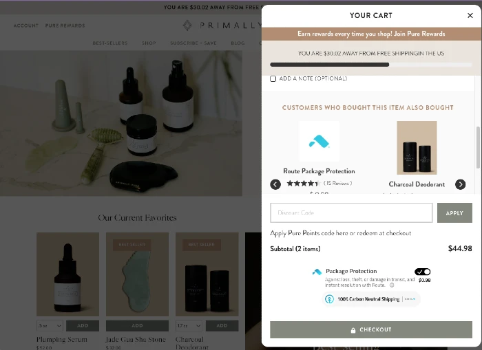
Best practice – Priced-based free shipping: For e-commerce stores that sell lower-priced items, show how far the buyer is from achieving free shipping. Combining this with cross-selling can be a powerful way to increase average order value. Primallypure.com provides a great example of how this can work:
#8 Consider Free Returns
Offering free returns can be a powerful way to increase conversions. It makes sense as you are eliminating the risk of buying a product that does not meet expectations.
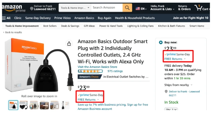
However, free returns can also be extremely costly for some ecommerce stores. For some, the gain in sales are outweighed by the loss from shipping costs, processing time, and wasted inventory. For this reason, offering free returns should be approached carefully. Any tests for effectiveness should measure costs as well as revenue.
If you decide to test this CRO tactic, consider the following best practices:
Best practice – Promote your free return policy. This is especially true if you are a smaller e-commerce store as many online shoppers have come to associate smaller stores with limited refund policies. Preemptively address this hesitation at the outset.
Trailcampro.com promotes their free returns using a banner above their main menu:

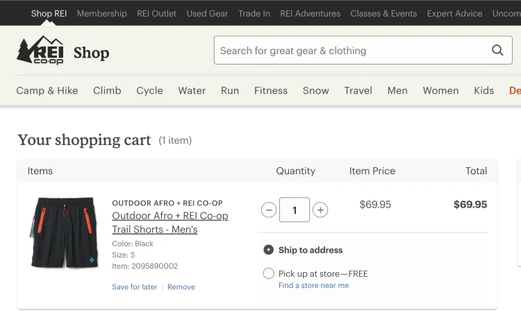
Best practice – Prevent preference-based returns. Preference-based returns (e.g., size, fit, ingredients, etc.) represent the largest and most avoidable type of return. To prevent these types of returns, ensure you clearly label product attributes from the beginning of the purchase journey all the way up to the checkout page. Other methods of preventing these returns include offering FAQ content where users can answer each other’s questions.
REI.com prevents preference-based returns by listing product preferences like color and size throughout the checkout process:
Best practice – Offer alternatives to refunds. If operationally feasible, start by offering exchanges. Wrong shirt color? No problem, we’ll quickly get you the one you want. If an exchange is not an option, offer in-store credit to keep the user on your store. You can use different means to incentivize this option. Amazon incentivizes in-store credit by increasing the speed by which you get your funds if you choose credit. You could take this one step further by offering 5% on top of the return to keep them in-store.

#9 Price Anchoring
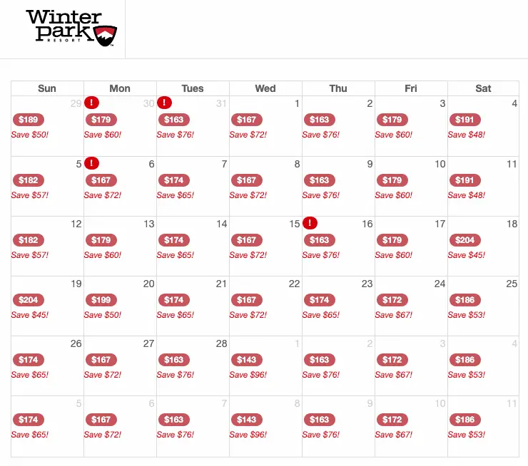
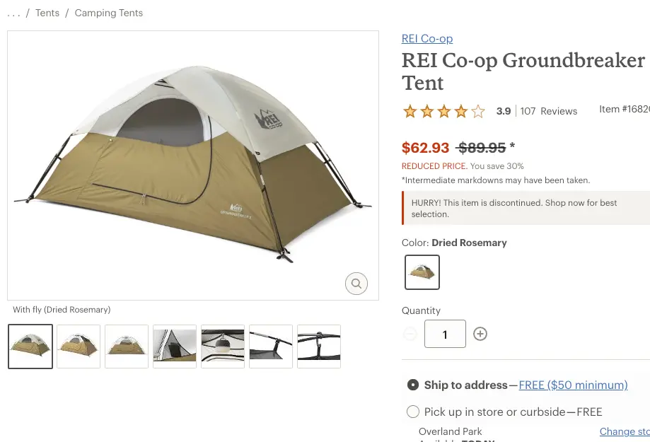
Price anchoring involves showing an initial price to a consumer, followed by a second, lower price. The consumer, who is anchored to the “higher” price, will then find the second price as more of a value. This tactic is used by many different businesses from e-commerce sites to your local car dealership, where the price offered always follows the MSRP.
Example – Winter Park Resort anchors their online price to their same day price:
Example – REI.com anchors their old price to their new reduced price:
#10 Create a Sense of Urgency
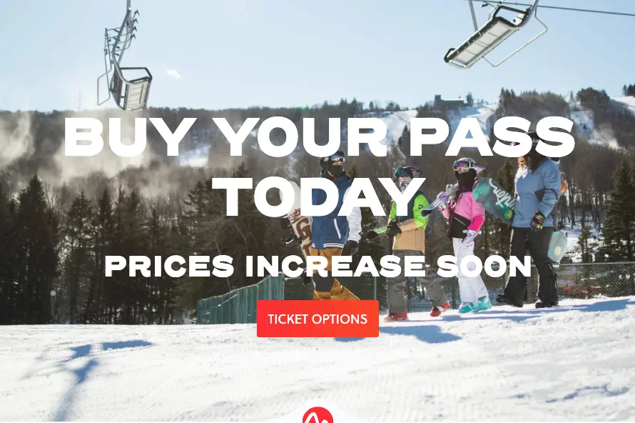
How many times have you taken action because of a limited time deal, expiring sale, or fear an item may go out of stock? It shouldn’t be too hard, just look back at your Cyber Tuesday order history:) Creating a sense of urgency gives your customer a reason to buy sooner rather than later.
Example 1 – Camelback Resort created a sense of urgency by adding “prices increase soon” to their season pass page.
#11 Showcase Product Scarcity
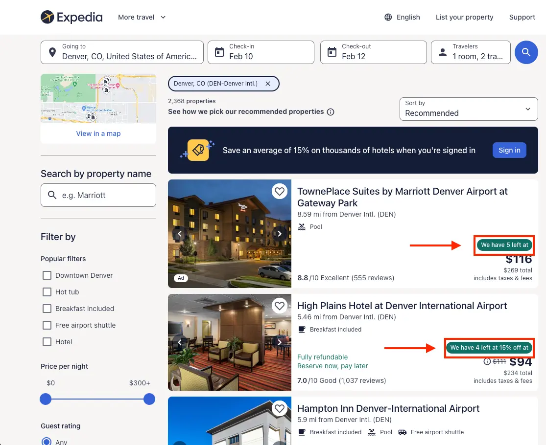
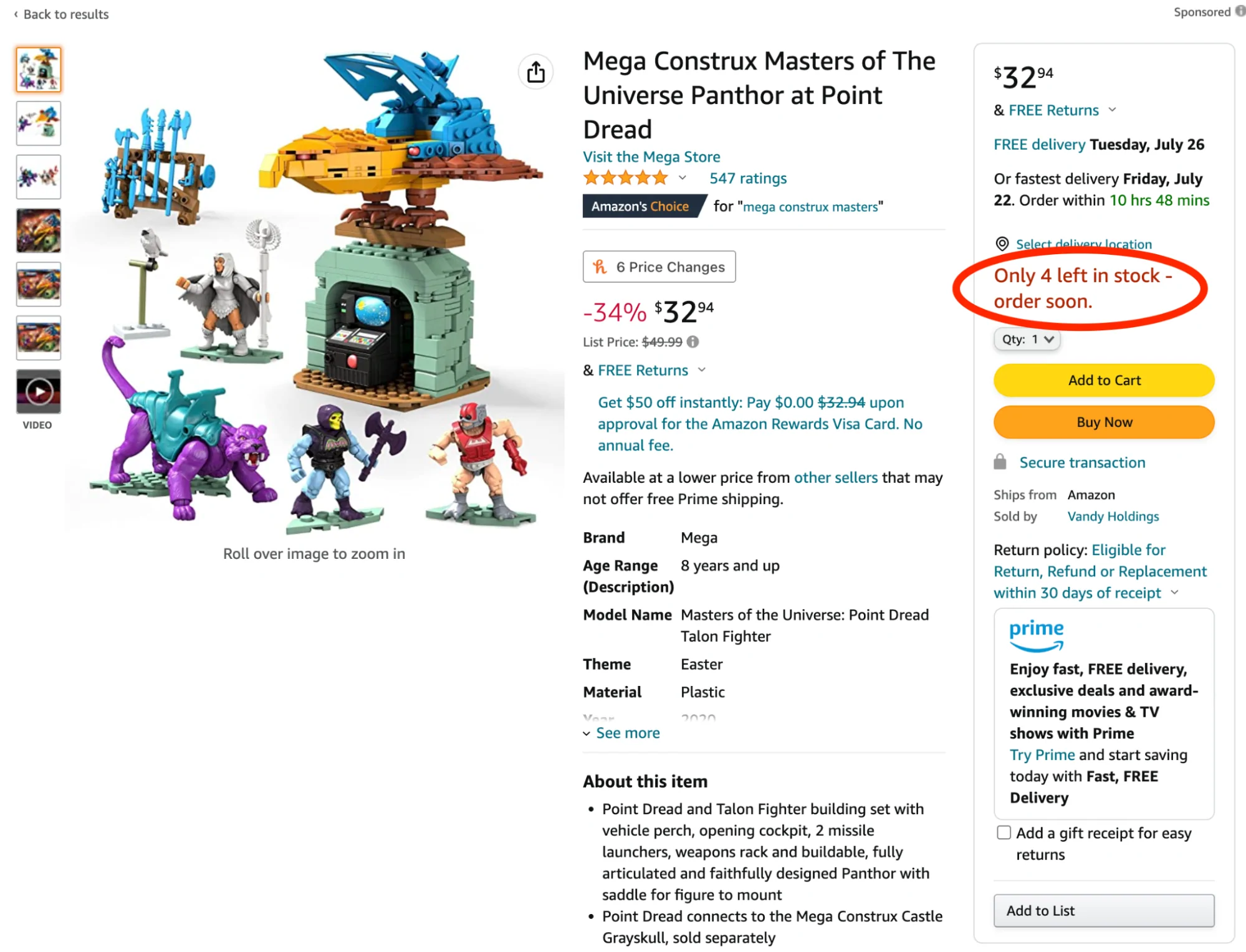
We value things that are in limited quantity. If you sell a product or service, you likely have only a certain number of items in stock or a limited number of openings. Showcase this scarcity and see sales soar.
Example – Expedia.com shows you how many rooms are left at a certain price to showcase scarcity. Notice it’s not how many rooms are left, just at that price:)
Example – Amazon.com shows how many units are left in stock to showcase scarcity.
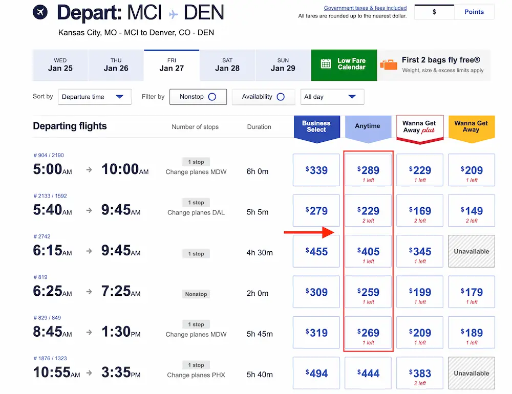
Example – Southwest.com shows how many seats are left on the plane to demonstrate scarcity.
#12 Buy Now Pay Later (BNPL)
Buy Now Pay Later providers like Affirm allow consumers to cut the pain of one large purchase into a set of smaller payments deferred into the future.
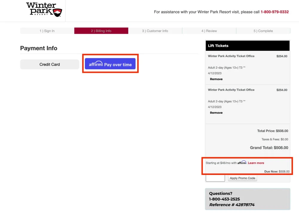
Online stores from Walmart to Amazon have adopted this form of micro financing due to its ability to increase conversion rates and average order value.
These alternate payment options drive more, and larger purchases by not only lowering the sticker shock, but also offering a means of payment with the perceived benefits of low-to-no interest rates, easier approval, and more flexible payment plans as compared to credit cards. Surveys indicate these factors are even more important to Millennials and Gen Z who may be weary of using credit cards for large purchases.
The perceived benefits of these platforms are reflected in their growth. BNPL payment solutions have seen a 200% annual average growth in gross merchandise value processed over the last three years with expectations by some of the market size growing another 291% over the next five years.
Relevant case studies:
- After implementing Affirm, businesses see an average conversion increase of 13.3 percent – Keep in mind this is a statistic provided by Affirm who is a BNPL provider.
#13 Upsell to Increase Average Order Value
Kalahari Resort upsells their lodging by offering multiple options for more flexible check-in and check-out times:
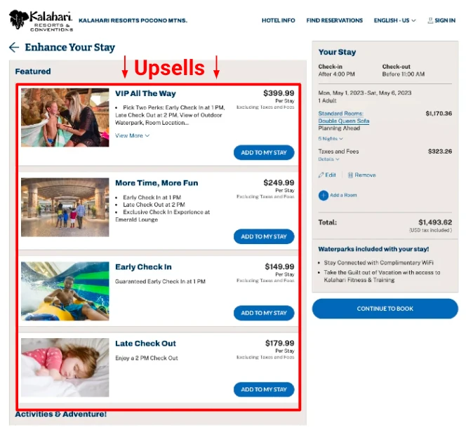
Upselling involves offering a more expensive version of a product or a small add-on to the product a customer is already interested in purchasing. If implemented correctly, upselling works because the merchant is offering additional value at a point in the customer journey when the customer is in “buying mode.”
The effectiveness of the upsell depends on factors such as how customized the offer is to the customer, how much the offer increases overall price, when it is offered, where it is offered, and how often it is offered. While there are general rules of thumb for each of these factors, it is best to test different options.
Applicable behavioral psychological principles:
- Aggregation effect: Painful experiences, like payments, are less painful when grouped together. In this way, incremental additions to a large order are seen as less costly than they would be had they been purchased on their own.
Additional reading:
Relevant case studies:
#14 Cross-sell Related Products
Cross-selling involves offering something complementary to what a customer is purchasing. For example, a new pair of hiking socks to go with your hiking boots. This can be contrasted to upselling which usually involves offering a more expensive version of a product or a small add-on.
Example: REI uses cross-selling at multiple points in the buying journey including when a user adds something to their cart:
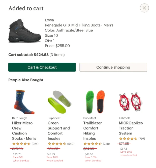
Why it works: If implemented correctly, cross-selling works because the merchant is offering something highly-related to the buyer’s initial desire/need at a point when the customer is in “buying mode.”
The effectiveness of the cross-sell depends on factors such as how customized the offer is to the customer, how much the offer increases overall price, when it is offered, where it is offered, and how often it is offered. While you should always test, here are some best practices:
Best practice – Ensure cross-sell options are carefully curated. Look to your analytics to understand which products sell well together.
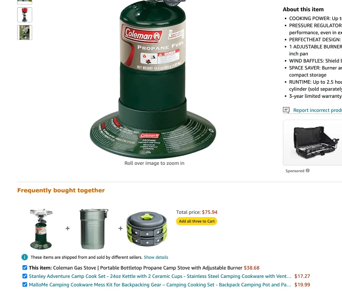
Best practice – Offer cross-sells at multiple points through the customer journey. Amazon offers cross-sells on the product page in addition to the cart and checkout page:
Best practice – Offer discounts for bundling items. This form of bundling occurs dynamically by offering a discount when the buyer chooses to add a cross-sell item to their cart. As small as a 5% discount can introduce some FOMO by offering a deal on something the buyer may likely want to buy later. Plus, with the right product combination, you san save on shipping. Here is a mockup of what this could look like on REI.com:

#15 Cart Icon Best Practices
The classic top-right shopping cart icon has become an expected navigation feature for online buyers and a crucial tool for conversion rate optimization:
This icon plays an important role for two types of users:
- For those moving through the digital aisles of your online store, it ensures they know items are being saved to their cart and that they can choose to shop for as little or as long as they want before moving to the next step.
- For those returning to the store after an initial browsing session, it allows them to easily pick up where they left off and complete their purchase without having to go back and find the items they purchased.
In both cases, this icon makes the process easier, removing any friction that can cause lost sales. Here are some best practices to maximize the benefits of this simple icon:
Best practice – The icon should update visually to reflect the cart status. Patagonia adds a red circle with the number of items in the cart to clearly illustrate the cart status:
Best practice – Save cart status for both guests and logged-in users. According to a study run by the Baymard institute, around 60% of cart abandonments are due to “just browsing.” The simple fact is that some visitors are just not ready to make a purchase, even when enticed through various CRO tactics.
Fortunately, with the right cart abandonment campaigns, you can recapture these visitors. When they do return, make sure they know you saved their cart and that they can easily move onto the checkout page.
#16 Instantly Apply Coupons
When offering a discount code, don’t send the customer on a side quest where they must navigate to their mailbox, wait for your coupon code, avoid a mailbox full of emails DESIGNED to distract, find the tab with your website, and try entering the code a few times before they get it right. In that hypothetical example alone, there were five points at which they may have given up.
Just apply the dang thing instantly.
Example – Primallypure.com targets cart abandonment with a discount code that is automatically applied.
#17 Default to Guest Checkout
Public Supply defaults to the guest experience. This removes a step in the checkout flow and reduces the perceived effort of creating an account.
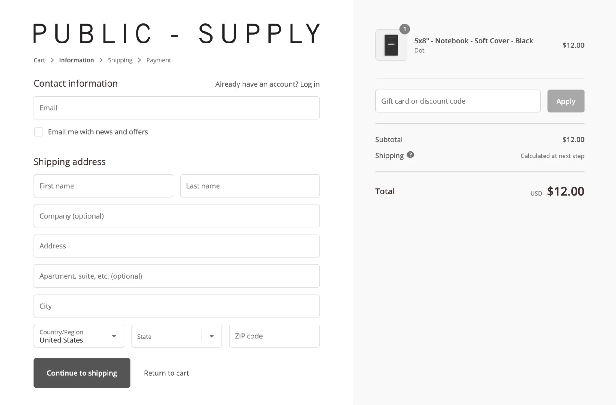
Almost a quarter of shoppers abandon their cart when prompted to create an account (source). The high abandonment rate is due to the high perceived effort that comes with this option.
I don’t know about you, but creating a password that matches the strict, special character, alphanumeric requirements of some IT nerd drives me insane.
By now, most e-commerce retailers have realized this source of friction and default shoppers to a guest checkout. Any missed data collection is well worth avoiding a 25% cart abandonment rate. Plus, you can easily follow up by email with incentives to prompt an account creation AFTER the sale is made. Here are some best practices when it comes to guest checkout:
Best practice – Default to guest check-out: Don’t offer it as an option the shopper must choose. This adds an extra step for the vast majority of shoppers who are going to choose the option anyway.
Best practice – If you want additional information, pay for it: If having their birthday, phone number, or permission to receive the newsletter is important, offer an incentive to get this information. For example, free shipping on the next order or a 10% discount.
#18 Add a Checkout Progress Bar
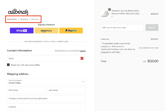
A checkout progress bar is something users have come to expect for multi-page checkouts. It puts shoppers at ease as they know exactly what the checkout process will require.
Best practices:
- Place the progress bar or steps at the top of the checkout form.
- Allow guests to click between the different steps, both forward and backward.
- Clearly label the different steps.
- Keep the number of steps under four.
- Use terminology customers expect, like “cart” > “information” > “payment.”
- Consider skipping the review step with a layout similar to the screenshot above. With this layout, the customer can review the order at any time on the right-side bar.
#19 Promo Code Best Practices
Promo/discount/coupon codes can be highly effective if implemented correctly. However, they can also be detrimental if implemented incorrectly contributing to drop-offs from distracted potential buyers or reduced revenue from those who would have otherwise paid full price.
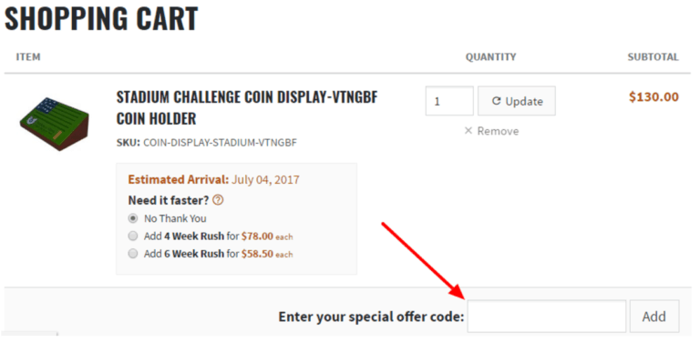
Here are some best practices around promo codes that will help you maximize the benefits of this CRO tactic and minimize potential losses:
Best practice – Hide or reduce promo code visibility on check-out pages.
These visitors are ready to buy. They’ve verified everything in their cart, have their credit card information available, and are a few form fields away from completing their purchase. When you show a promo code, you are essentially suggesting that there is a better price out there that is only a few Google search results away.
Best case scenario, you’ve seeded a coupon code on Retailmenot and are going to take a 10-20% hit in revenue due to the markdown and affiliate payout.
Worst case scenario, a conquesting campaign from a competitor offers them a deal you don’t have and you lose the sale.
To avoid this, leave the promo code field off the check-out page OR make it less visible.
Best practice – Make it easy to understand a promo code has been applied by clearly showing the markdown.
Cross out the old price and add the new price. This also anchors the new price to the old price, framing up the value.
Best practice – Do not make the user visit their email box to find the promo code.
It is fine to request their email in return for the promo code. But don’t send them on a quest to find the code, a quest full of distractions that may divert them from ultimately making the purchase.
#20 Cut Down the Number of Form Fields
From checkout forms to sign-up forms to free trial forms, users are constantly being asked to submit information. For someone on the fence about your offering, the perceived and actual difficulty of your form can be the difference between a user clicking the submit button and a user clicking the back button.
Form optimization is an entire subject on its own. Checkout my complete guide to form optimization here.
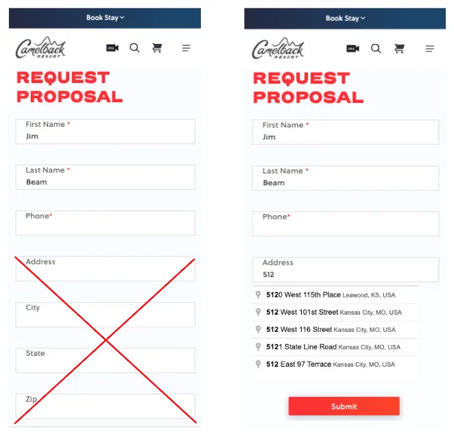
Example – Camelbackresort.com cut four fields to one by adding the Google Places Autocomplete feature to their form. Same information, 40% less data input.
#21 Order Summary Visible Throughout Checkout
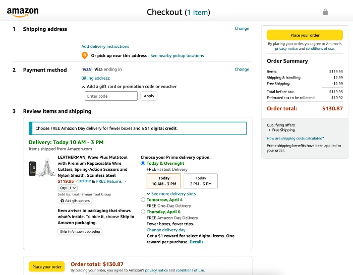
Show a checkout summary including the attributes selected (color, size, etc.) and an image representing the purchase. This avoids a situation in which the user hesitates to make a purchase because they’re unsure they selected the right item or item attributes.
The image is important because it reinforces the emotional connection the buyer made with the product, reinforcing the ultimate decision to buy.
Example – Amazon.com includes a product summary with an image for every order.
#22 Add Customer Support Info to Checkout Page
Chat, call, and help centers all play a part in addressing last minute objections or issues customers may have.
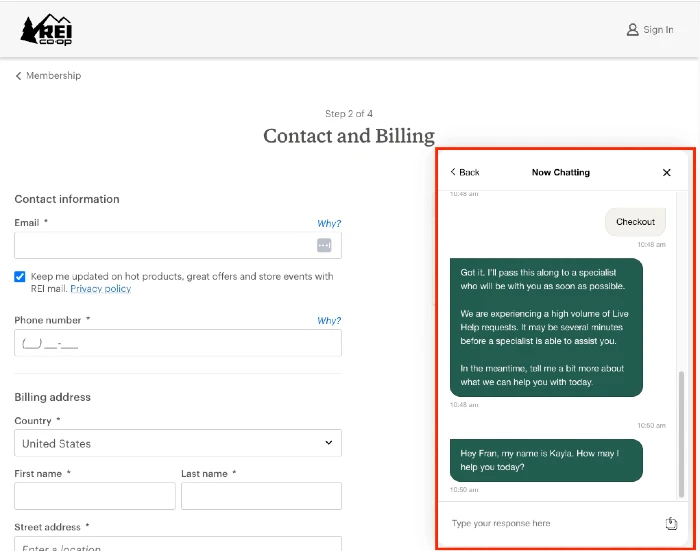
The last thing you want is for someone to abandon their cart because they couldn’t get an answer to a simple question that would have sealed the deal.
Here are some best practices when it comes to customer support resources on the cart and checkout page:
Best practice – Make these resources easy to find. Most users expect to find customer support resources like phone numbers and knowledge centers in the top-right of the page or the page footer. Most users expect to see the chat box in the bottom-right.
Best practice – Trigger chats on inactivity or form errors. While forms should prevent and handle errors well, sometimes a user and a form just aren’t feeling each other. Preemptively triggering the chat button can help in these circumstances.
#23 Add Estimated Arrival Dates
Native leaves me guessing. Primally Pure tells me exactly when I’ll see my order.
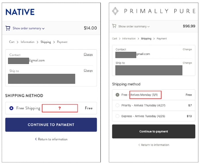
Arrival dates contribute to customer certainty.
Customer certainty contributes to higher conversion rates.
Here are some best practices for adding estimated arrival dates:
- Use actual dates instead of estimated delivery windows. Knowing I’ll receive my order this Thursday is more helpful than the fact it will arrive in three business days.
- For users where you know their location, display this information on product display pages.
More best practices can be found here.
#24 Upcharge For Faster Shipping
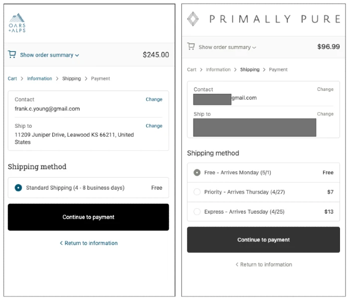
Some shoppers want their product fast and are willing to pay for it. If you don’t offer an expedited shipping option, they may abandon their cart for a competitor with faster delivery.
Oars & Alps (left) leaves me with one standard option. Primally Pure (right) gives me several options to get my product faster if I’m willing to pay for it:
#25 Avoid Unexpected Fees
Instead, absorb these fees into either the product price or shipping fee. In addition to avoiding the negative sentiment that comes with surprise fees, it requires less cognitive effort for the shopper.
Dr Squatch tells me I have free shipping and then follows up with a process fee of $1.
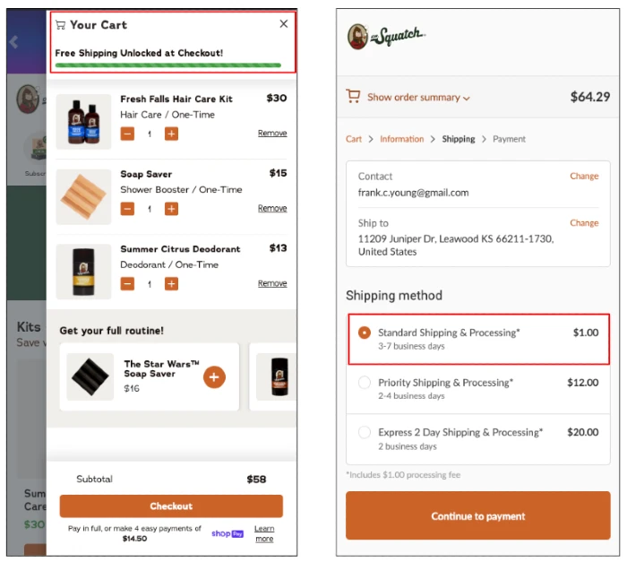
There are a variety of reasons this impacts conversion rate. 1) More cognitive effort to investigate the unexpected upcharge 2) Shoppers don’t like negative surprises 3) It comes off as cheap and impersonal. This negative brand sentiment alone may drive some to abandon the product.
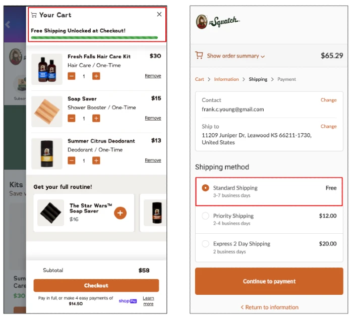
Here’s what it could look like assuming the processing fee was absorbed into the product price:
HATE NEWSLETTERS?
Me too! That’s why I only send emails when I have:
- New tactics you can easily apply
- Slides or checklists you can customize for your business
- Tools that can speed up your day
Want to give it a shot? Sign up here:
